
Moneytree Personal
UI Improvement Case Study
Reframing a personal finance dashboard so information feels clearer, more accessible, and easier to navigate.
- Role
- UI/UX Designer
- Project
- Independent product critique
- Scope
- UI evaluation, visual direction, navigation, prototype
- Platform
- iOS
- Tools
- Figma
Focus
Make the Personal section easier to understand.
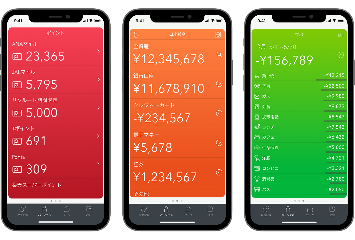
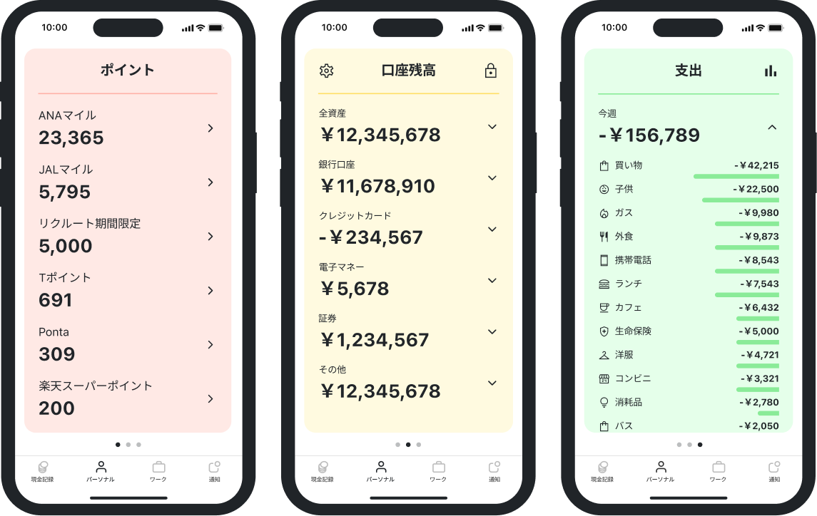
I focused this case study on Moneytree Personal’s card-based Personal section. The aim was to find a clearer way to present balances, spending, and points while preserving the compact dashboard model.
Evaluation
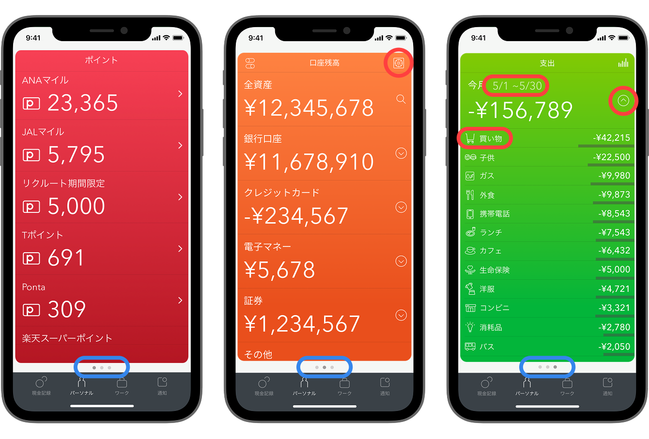
The interface lacked contrast, brand, and context.
- Low-contrast text and icons reduced readability, especially for users with visual impairments.
- The interface made limited use of Moneytree’s color system and felt detached from the brand.
- A dots indicator suggested more pages, but did not explain what information was available.
Visual direction
Using color and spacing to clarify what each card represents.
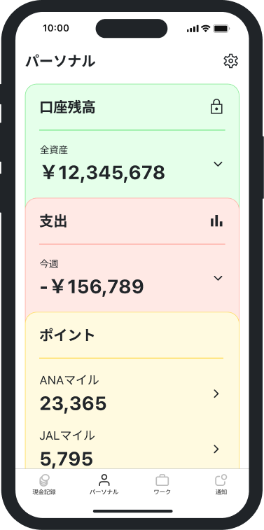
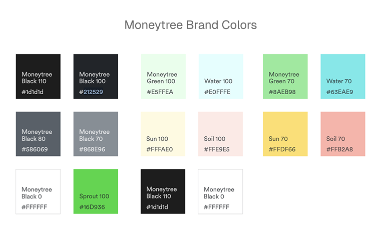
The first thing I did to improve the UI was to add a stronger contrast, more generous spacing, and Moneytree’s brand colors. Each content area then received a familiar contextual color: green for money and earnings, red for debt and expenses, and yellow for coins, points, and rewards.
- Green →
- Money, earnings, positive
- Red →
- Debt, expenses, negative
- Yellow →
- Coins, stars, rewards


Navigation
Refining the navigation to better represent a personal wallet.
Over iterations of UI refinements, I decided on a stacked-card composition that resembles physical financial folders and papers. The cards are placed one on top of the other, and the visible card edges communicate that more information is available, while the Personal heading and contextual labels make the section easier to understand at a glance.
Tapping on each card expands the section, allowing the user to read and further expand the contents of the section. The cards also have a swipe gesture, where swiping down on the card stack allows the user to take a peek at the content inside the card, further mimicking how physical folders and papers react.
This redesign can be experienced via the Figma prototype below: