
Good Enough Matcha
Branding & Visual Identity Design
Building the visual identity of a matcha brand from the ground up.
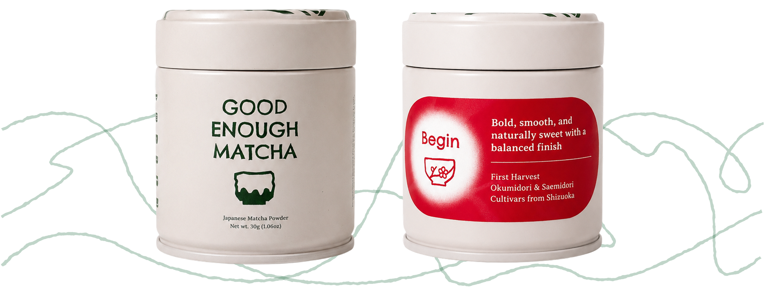
- Role
- Designer
- Team
- Good Enough Matcha
- Responsibilities
- Logo design, brand visual assets, packaging design, web design & development, social media templates
- Deliverables
- Packaging design, social media, responsive web
- Tools
- Figma, Affinity, Shopify
The task
Creating a visual identity that reflects the ethos of the brand
The project began with defining a visual identity for a matcha brand built around anti-perfectionism, groundedness, and reflection. Designed for people experiencing choice and decision fatigue, the brand offers a simpler approach to consistently high-quality matcha.
I began by translating these values into a visual direction, exploring logo concepts that could capture the brand's relaxed, imperfect, and approachable character.
The logo
A logo inspired by matcha bowls and kirie
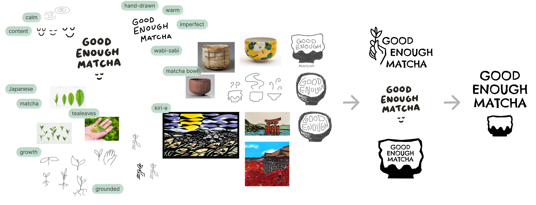
I began with hand-drawn sketches, exploring visual references from tea leaves, the Japanese tea ceremony, and traditional Japanese art forms. These explorations led to three distinct directions: a hand holding tea leaves, a serene face, and a matcha bowl.
The matcha bowl was selected as the strongest expression of the brand, particularly its connection to the concept of wabi-sabi, the appreciation of beauty in imperfection. Inspired by kirie, the Japanese art of paper cutting, I refined the concept into an organic, paper-cut mark with intentionally imperfect edges. This became the core visual symbol of Good Enough Matcha.
A recognizable and versatile logo for the physical and virtual
The logo system was designed to remain flexible across a range of applications, from matcha packaging and the online shop to social media and digital content. To ensure the identity remained clear and recognizable at different scales, I developed multiple logo configurations for different contexts.
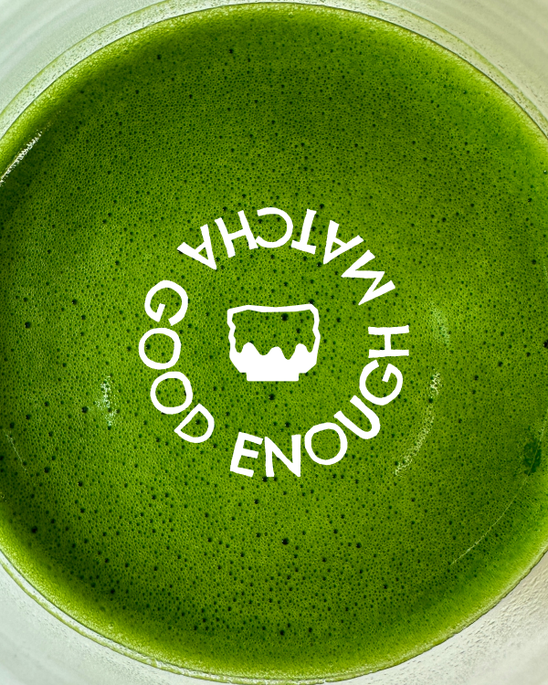
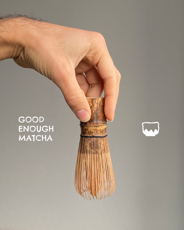
These include a standalone bowl mark, stacked and horizontal lockups, and a circular variation, allowing the brand to adapt across both compact and wide-format placements while maintaining a consistent visual identity.

A visual theme
The logo inspired an expanded family of visuals for the brand
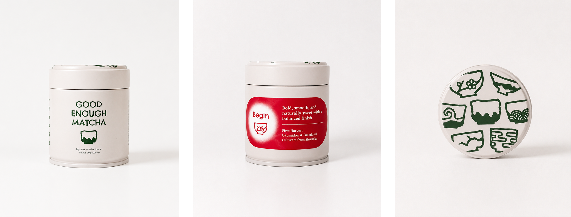
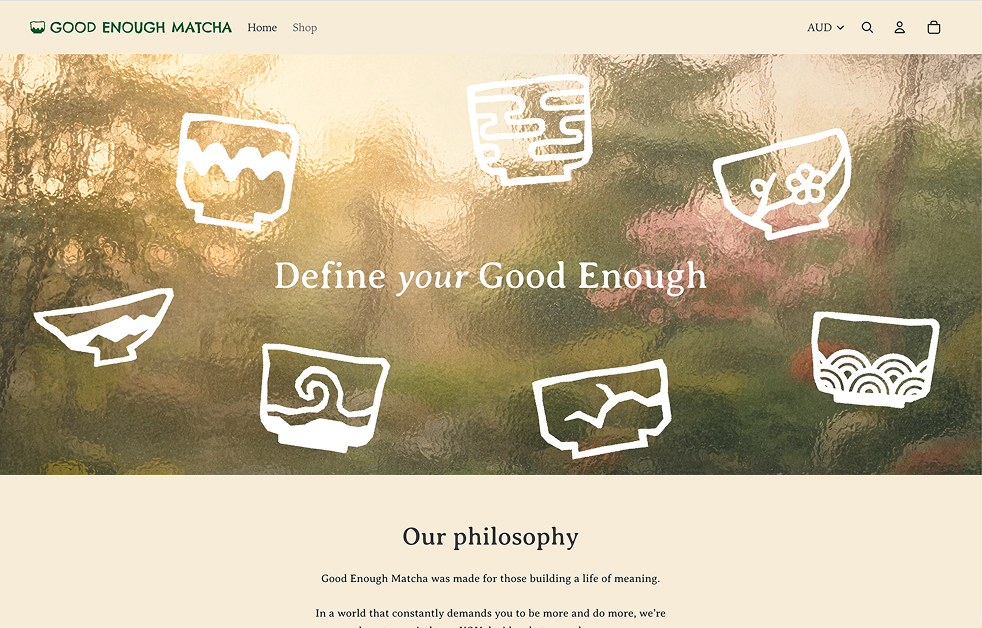
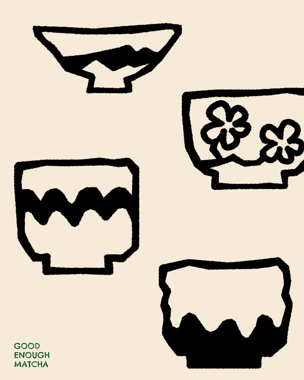
The matcha bowl concept was expanded into a series of illustrated bowl variations, with patterns and details inspired by nature. These designs extend the visual identity beyond the primary logo and can be applied to individual products, promotional materials, and decorative elements across the brand.

Packaging design
The can: A playful, distinctive design
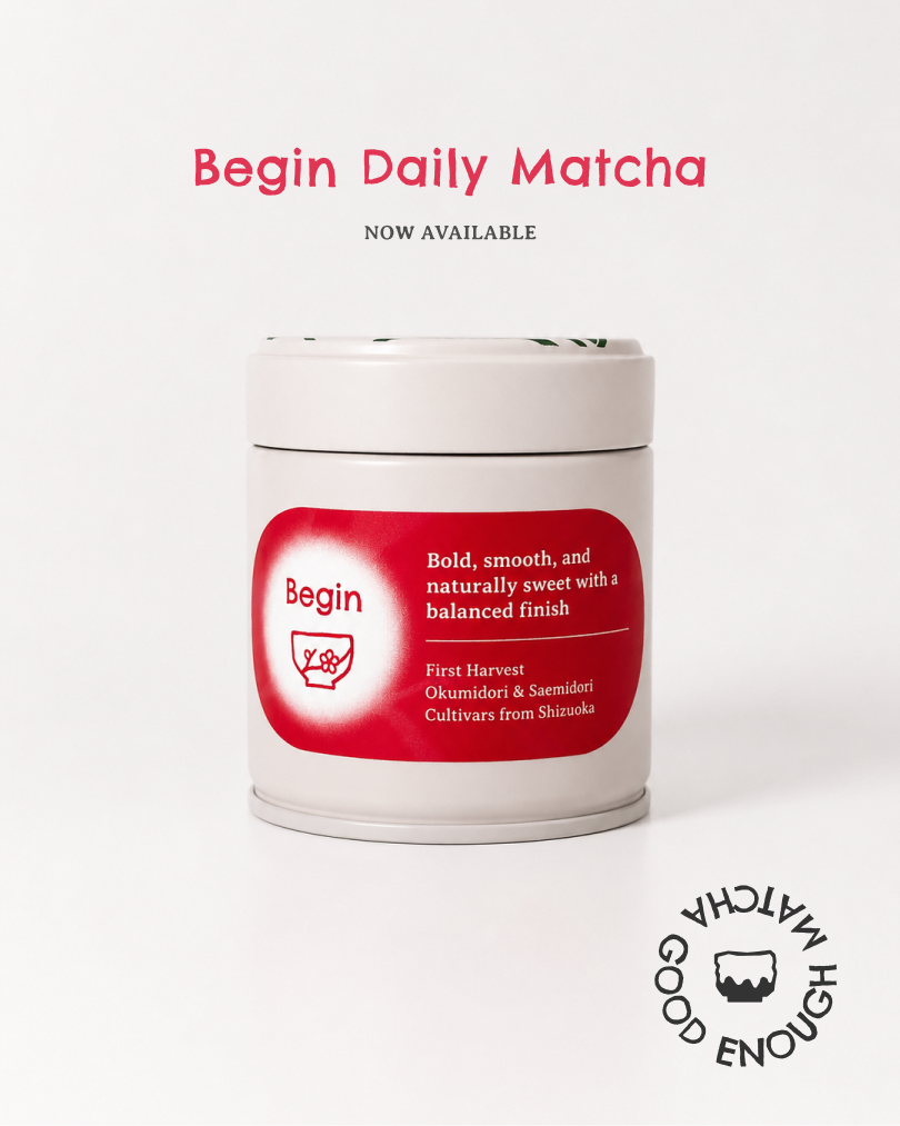
The tin features the Good Enough Matcha logo alongside a vibrant label identifying the specific matcha variety. On the lid, a playful arrangement of illustrated matcha bowls surrounds the central logo, extending the brand's visual language across the packaging.
The box: Representing the calming effect the matcha provides
The tin features the Good Enough Matcha logo alongside a vibrant label identifying the specific matcha variety. On the lid, a playful arrangement of illustrated matcha bowls surrounds the central logo, extending the brand's visual language across the packaging.
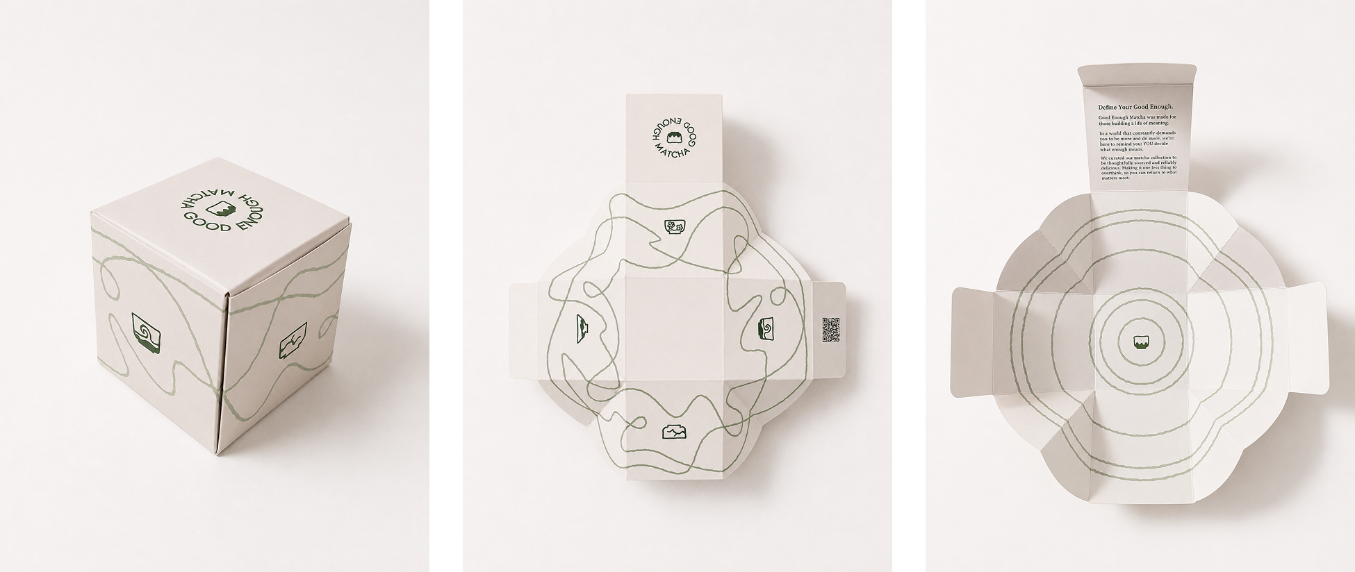
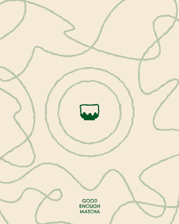
The outer box represents the noise and chaos of everyday life through irregular squiggled lines and decorative matcha bowl motifs wrapping around each surface. Opening the box reveals a contrasting interior: a calm ripple pattern with the tin positioned neatly at its centre. This shift from visual chaos to order reflects the sense of calm, simplicity, and pause that Good Enough Matcha aims to provide.
Website & social media
Brand logo, colors, and visuals were brought to the website and social media
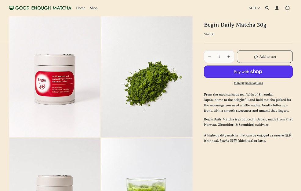
The brand identity was carried through to the online storefront, where the color palette, typography, logos, and illustrations create a cohesive digital experience. Maintaining this visual continuity from packaging to website helps immerse customers in the world of Good Enough Matcha and strengthens recognition across each touchpoint.
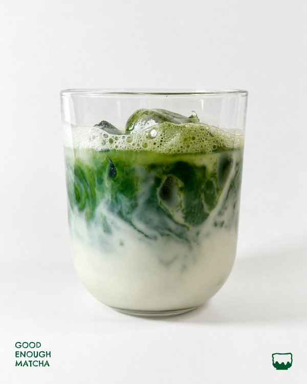
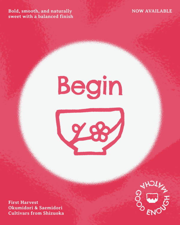
The same visual system also extends into social media, where the logo, brand colors, and illustrated elements are used across promotional content. These posts act as an entry point into the brand, introducing its personality and visual language before customers reach the storefront.
Results & impact
A unique and thoughtful visual identity for a budding brand
The final identity brings together a distinctive logo system, packaging, digital storefront, and social content into one cohesive brand experience. By balancing playfulness with calm, imperfection with intention, and traditional Japanese influences with a contemporary visual language, Good Enough Matcha was given a recognizable identity that feels both approachable and considered. The result is a flexible visual system that gives the brand a strong foundation to grow across future products, campaigns, and customers.

The website for Good Enough Matcha can be accessed below:
View live page