Plant Shop App
Design System Creation
Building a flexible visual foundation from tokens to reusable product components.
- Role
- Product Designer
- Project
- Independent design-system study
- Scope
- Foundations, variables, atomic components, app application
- Platform
- Mobile app
- Tools
- Figma
Objective
Creating consistency before creating screens.
This study explores the process of creating a design system from scratch for a mobile plant shop. The goal was to define a compact set of foundations, then prove that those decisions could support flexible, cohesive product UI.
Foundations
A natural palette and a practical type scale.
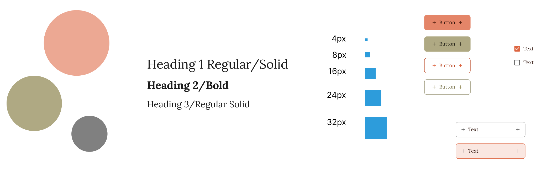
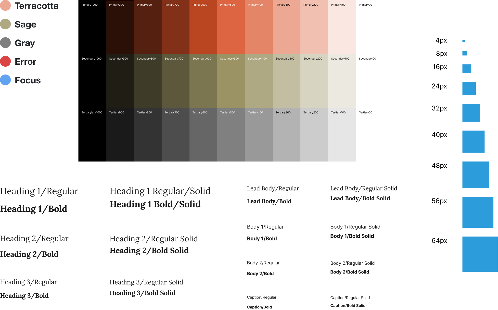
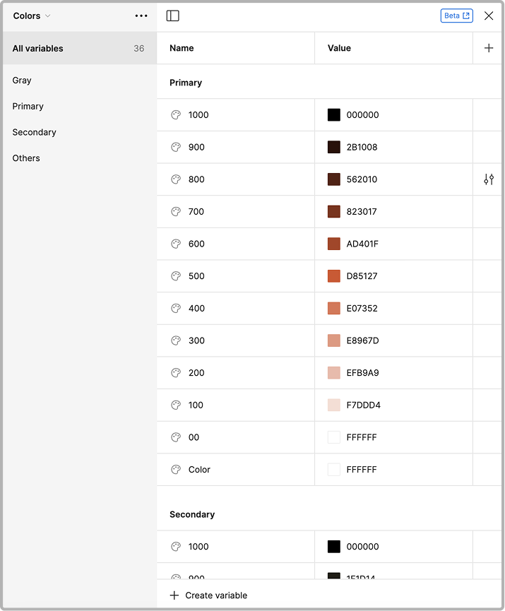
The color system uses earthy terracotta and sage tones inspired by plant pots and foliage, supported by a neutral gray scale. Focus and error colors extend the palette to functional interface states.
Lora and Inter were selected as the primary typography, offering a refined yet warm feeling to the brand. Font sizes, weights, and line heights are organized by their role in the hierarchy so designers can choose by intent instead of manually rebuilding styles.
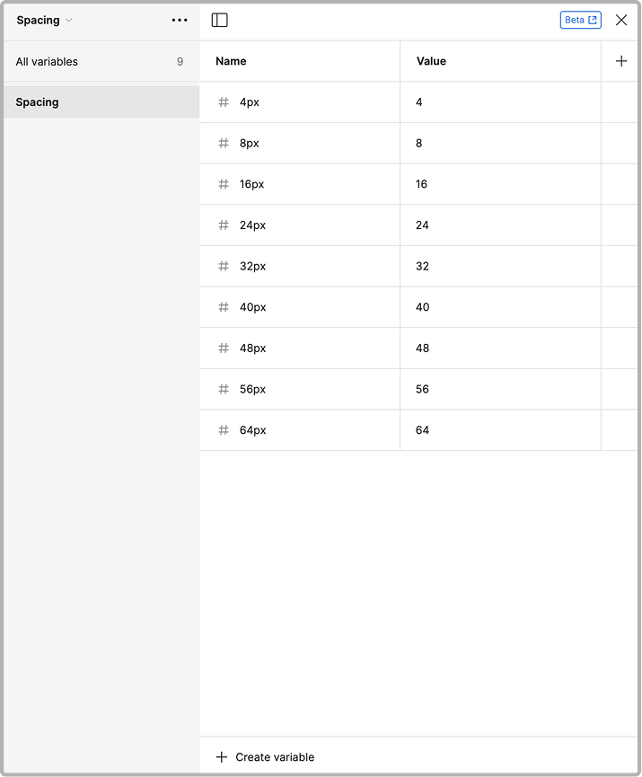
The spacing scale ranges from 4px to 64px, utilizing an 8px grid system with a 4px half-step for micro-adjustments. This consistent progression establishes clear spatial relationships, UI balance, and visual hierarchy across components.
Systemization
Variables help enforce design rules and minimize unwanted inconsistencies.
Colors, spacing, and other reusable values are stored as Figma variables. This reduces careless inconsistencies, speeds up design creation, and makes future system-wide updates much easier.
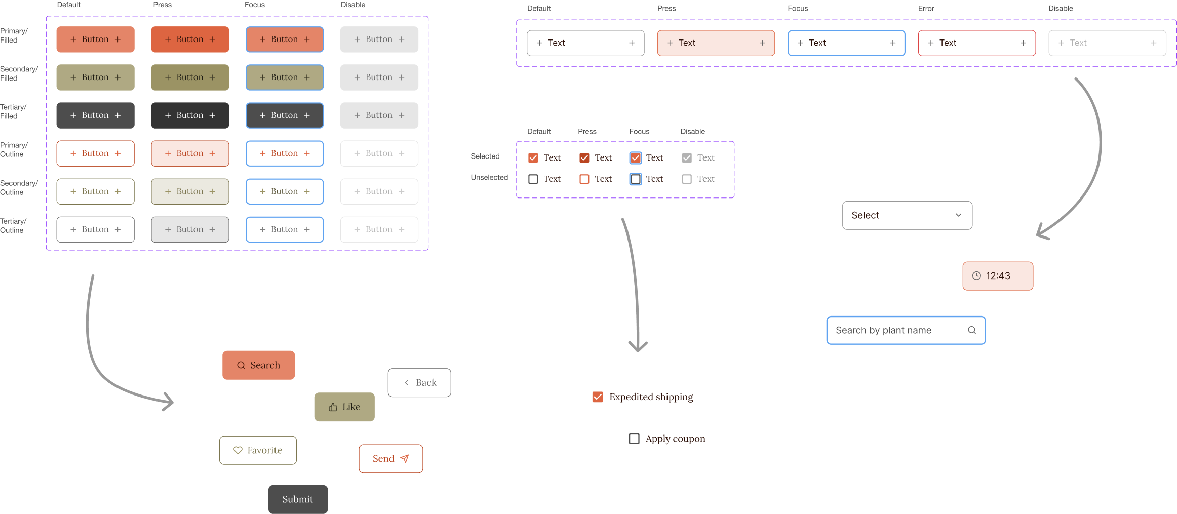
With the foundations in place, I built atomic components for buttons, inputs, and checkboxes. Variants capture common states while keeping each component customizable for product needs.
Application
The system comes together in the product.
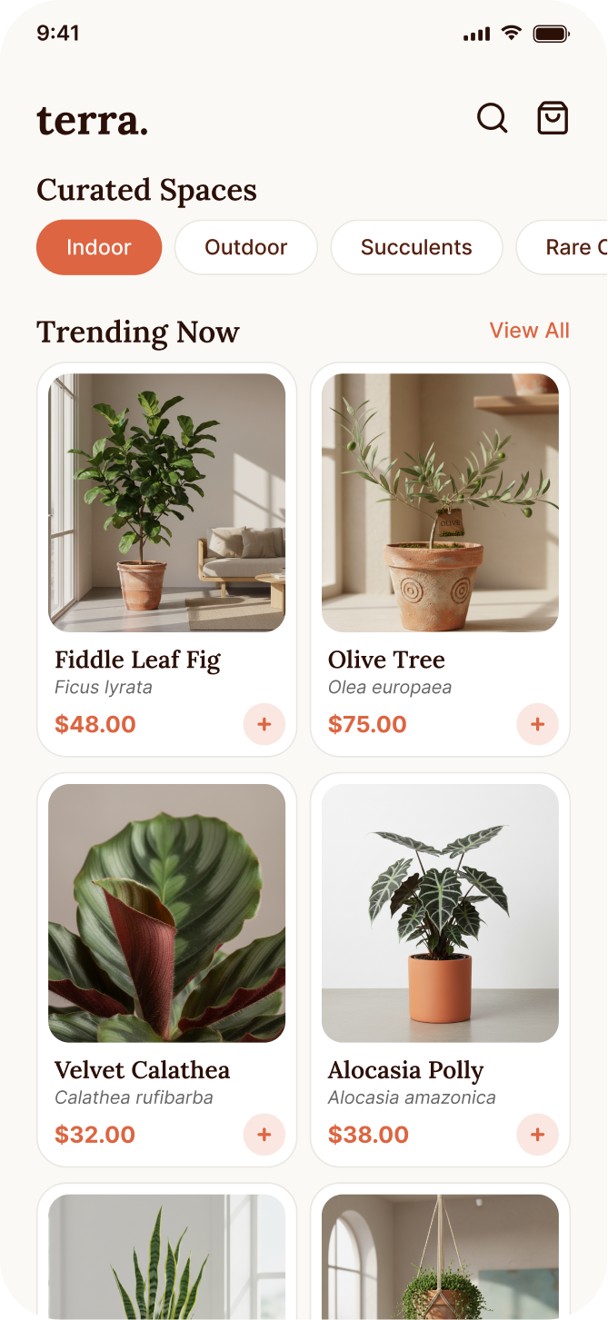
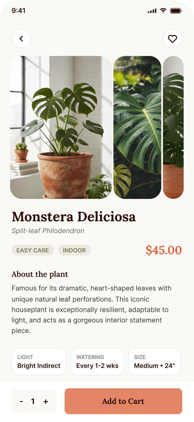
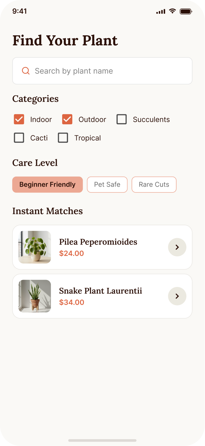
The resulting screens demonstrate how a small, well-structured system can create distinctive product designs without sacrificing consistency. Shared foundations make the shop easier to extend as new screens and states are added.