Rakuten GORA
Customer Review Page Redesign
Refining customer reviews into a clearer, more confident decision tool.
- Role
- UI/UX Designer
- Team
- Rakuten GORA Design Team
- Responsibilities
- UX audit, wireframing, UI design, component specs, developer handoff
- Platform
- Responsive web
- Tools
- Figma
The problem
An important decision point felt disconnected.
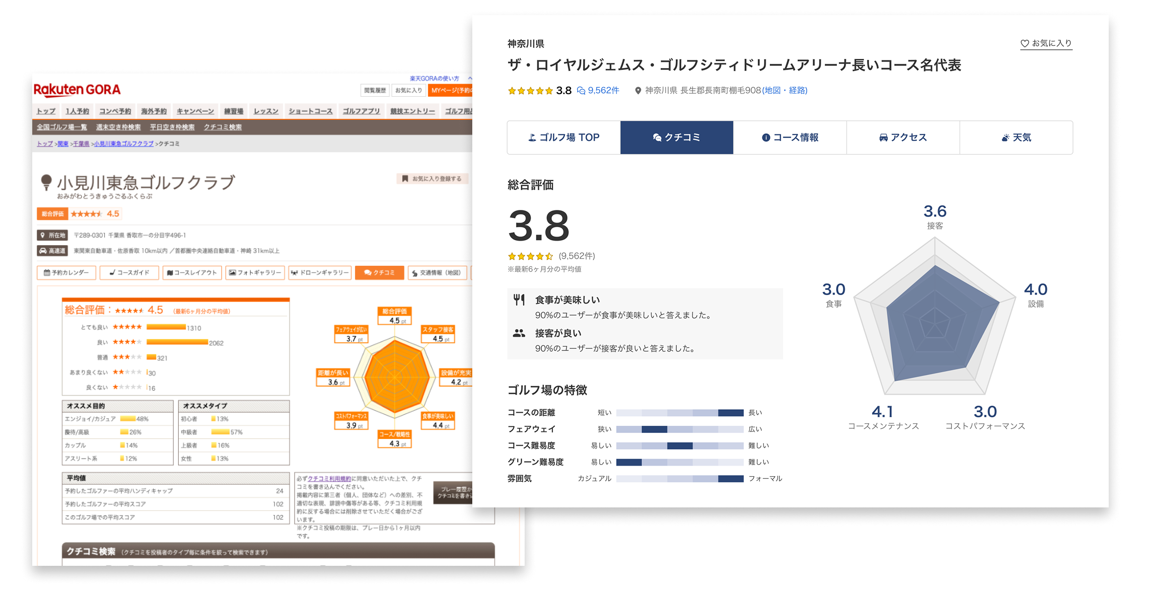
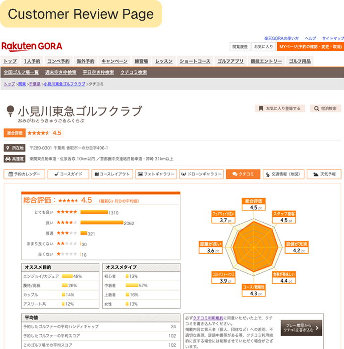
Rakuten GORA’s facility detail pages had recently been updated, but the customer review page still used the older interface. The inconsistency weakened the overall experience at a critical point in the booking journey.
The page also lacked a clear information hierarchy. Dense content, limited sorting, and hard-to-compare scores made it difficult for golfers to evaluate course quality efficiently.

Audit
Four issues shaped the redesign.
As an initial step, a UX audit of the existing customer review page was conducted to identify usability issues, visual inconsistencies, and gaps in functionality.
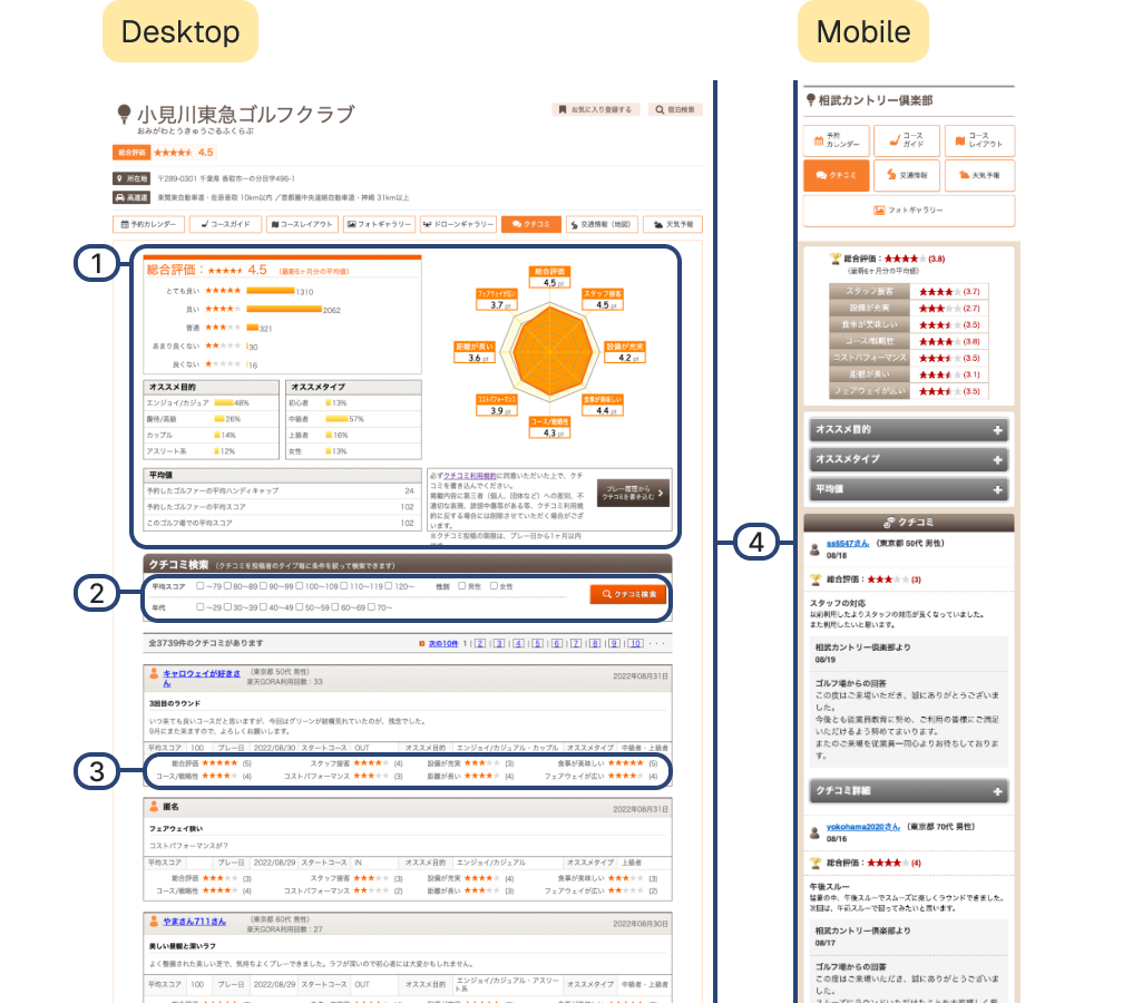
- 1A visually dense layout made reviews difficult to scan and compare.
- 2Sorting and filtering did not support score or content relevance.
- 3Overall and category scores lacked a strong visual hierarchy.
- 4Mobile and desktop patterns were inconsistent, reducing trust and cohesion.
Research
Research and analysis were conducted on existing interface patterns.
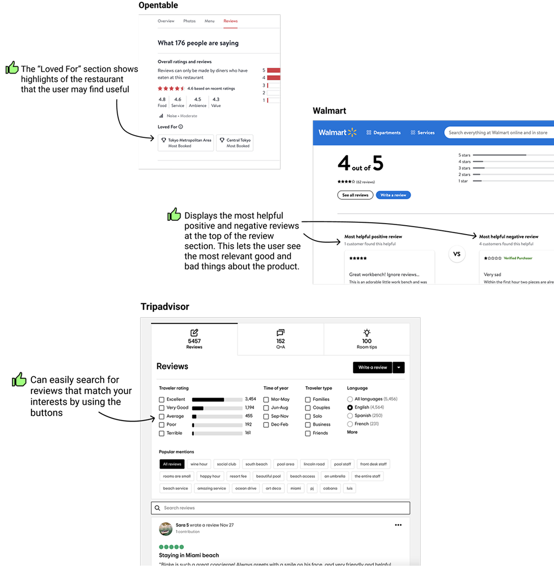
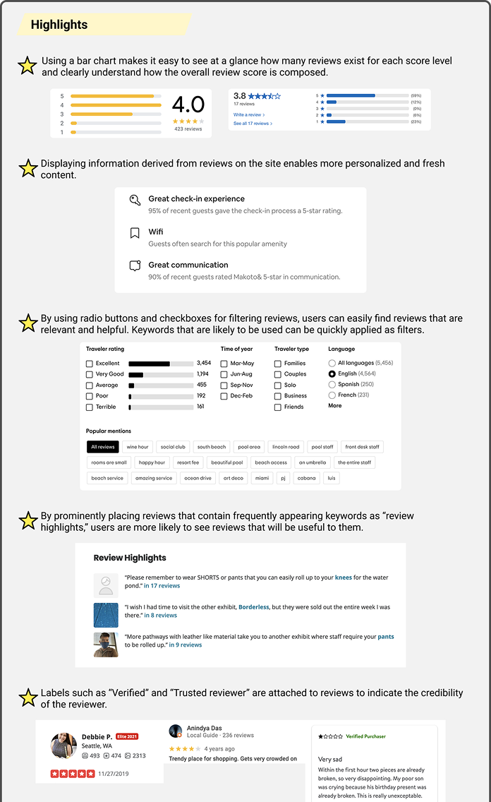
A comparative analysis of customer review interfaces across leading digital services was conducted to identify effective UX patterns and best practices. The research focused on how review-heavy platforms structure information, support filtering and sorting, and enhance scannability to aid user decision-making.
Key features, interaction patterns, and visual design approaches were synthesized and translated into potential design opportunities for the redesign.
Design decisions
Design revisions were made through cross-functional feedback.
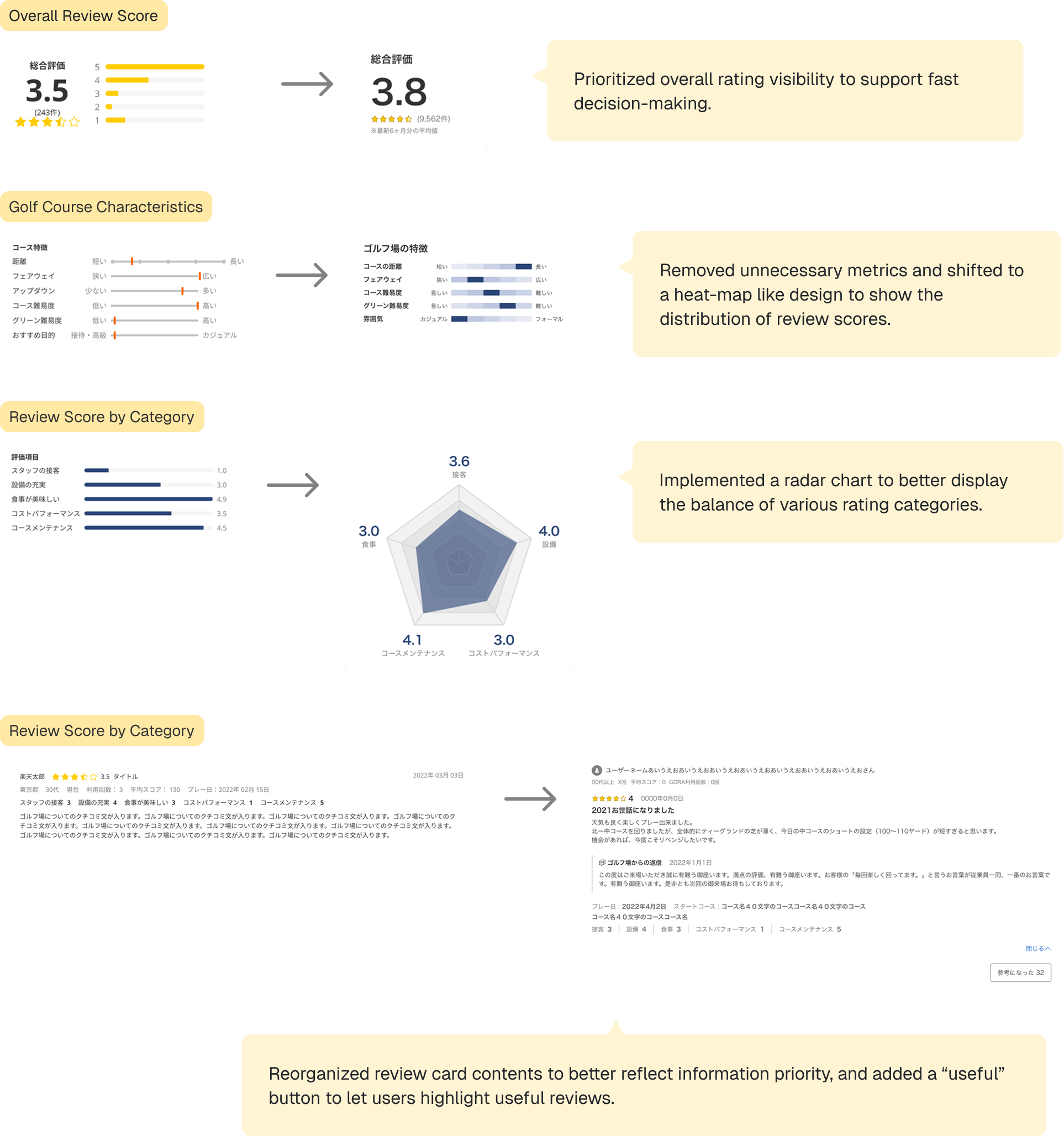
After wireframing, the design was iteratively refined through cross-functional feedback from design, business, and development teams. Improvements focused on hierarchy, readability, and feature clarity while ensuring technical feasibility. All components were designed responsively to maintain visual and functional consistency across mobile and desktop.
Key design decisions
- Prioritized overall rating visibility to support fast decision-making
- Introduced review highlights to surface high-value insights
- Standardized rating visuals across mobile and desktop
- Designed scalable components for future feature expansion
Results & impact
A more confident path from feedback to booking.
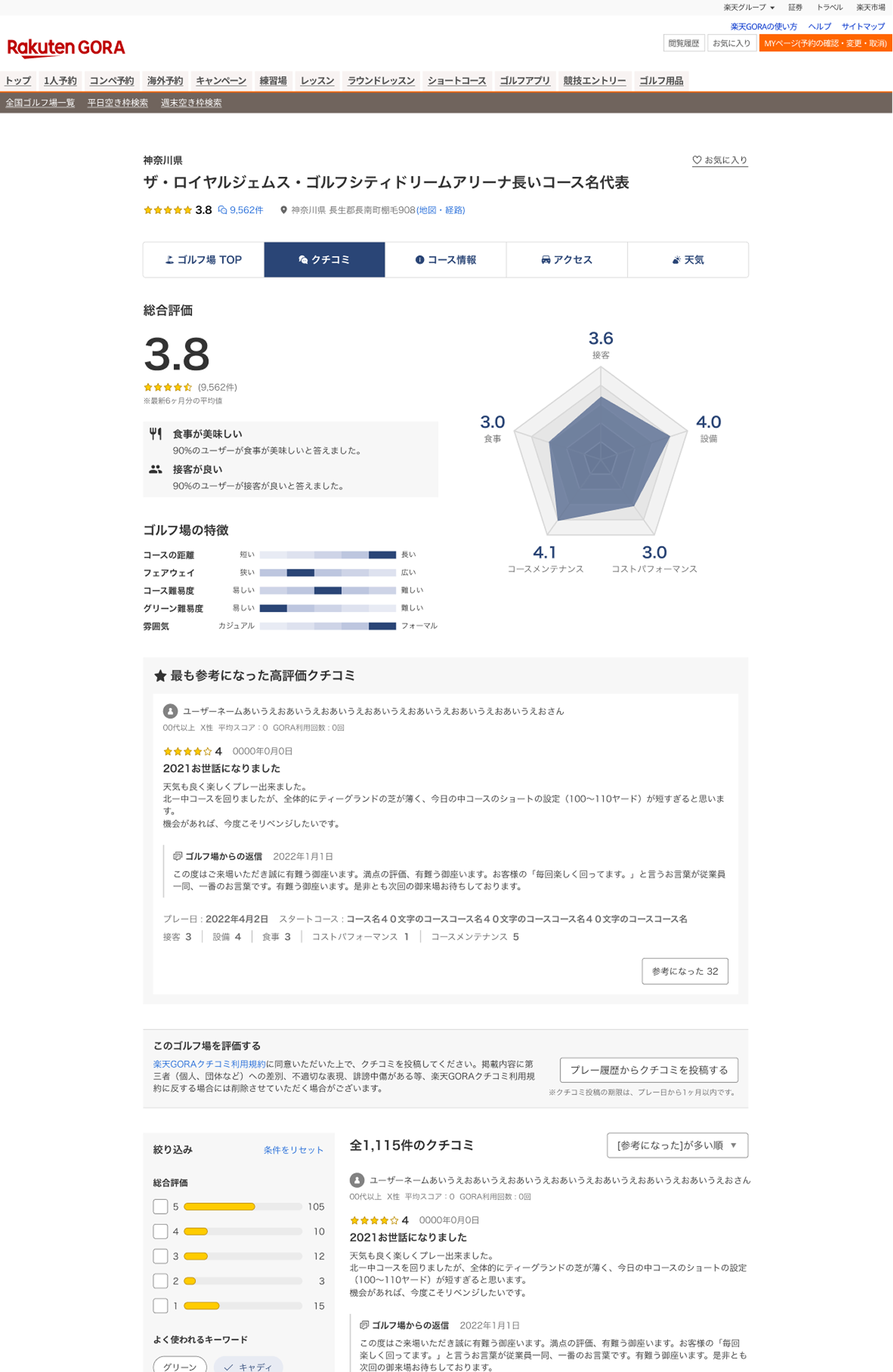
The redesigned customer review page significantly improved visual consistency across the platform by aligning with the updated facility page UI and creating a more cohesive product experience.
By restructuring the information hierarchy and emphasizing key metrics such as overall ratings and highlighted insights, the new design made reviews more scannable and easier to evaluate. Newly introduced features, including review highlights, featured reviews, and sorting by score enhanced users’ ability to quickly find relevant feedback and make informed booking decisions.
Additionally, unified components and responsive design specifications resolved previous inconsistencies between mobile and desktop, ensuring a consistent and scalable experience across devices. Overall, the redesign transformed the review page into a clearer, more decision-supportive touchpoint within the reservation journey.